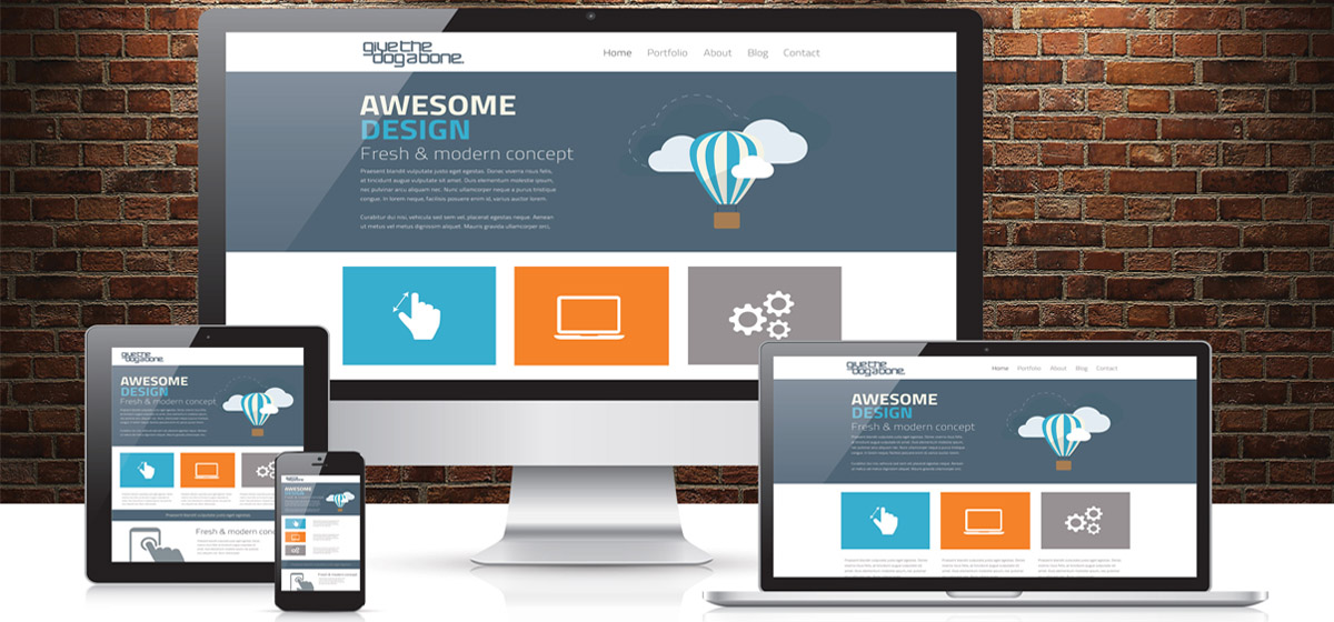
Modern CSS gives us powerful tools to create responsive layouts without traditional media queries.
CSS Grid auto-fit
The auto-fit keyword creates responsive grid items that adjust to available space:
.grid {
    display: grid;
    grid-template-columns: repeat(auto-fit, minmax(250px, 1fr));
    gap: 1rem;
}
Container Queries
Container queries let components respond to their parent container size, not the viewport:
.card-container {
    container-type: inline-size;
}

@container (min-width: 400px) {
    .card {
        display: flex;
        gap: 1rem;
    }
}